DEVLOGS & RELEASES
DEVLOG - NOVEMBER 28, 2023
Traversal Devlog: High Contrast

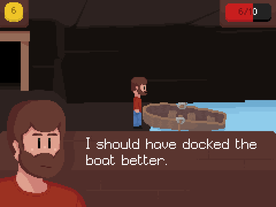
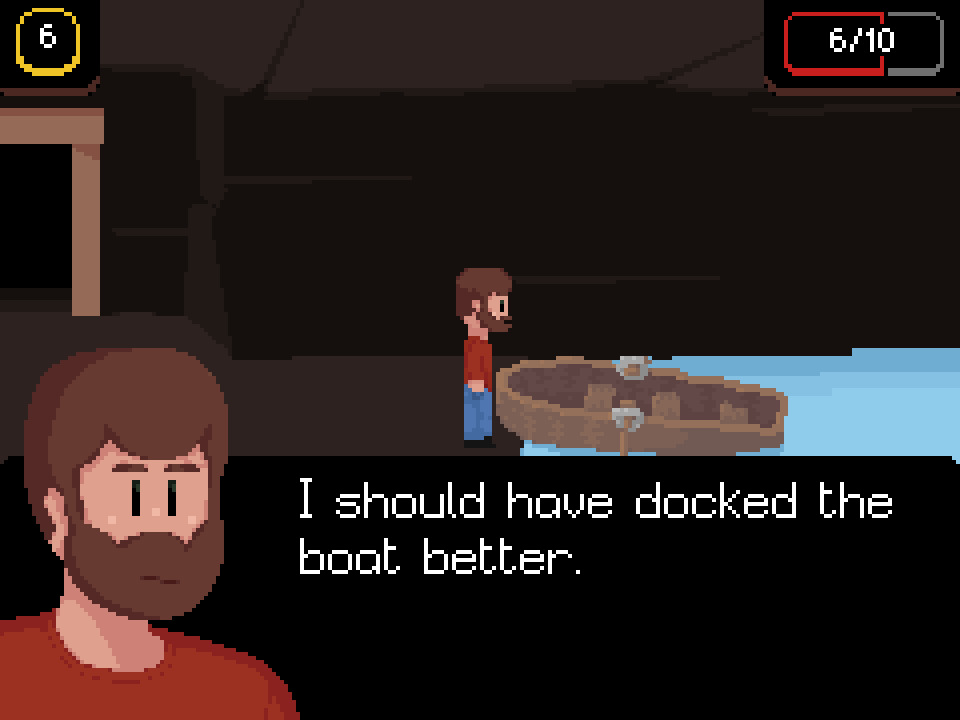
 Traversal has a High Contrast setting in its Accessibility settings. However, all it does in the current release is make any brown backgrounds black for better text readability. Recently, I've been working on improving readability on other UI elements such as the Healthbar and Currency UI.
I'd be curious to know what people think. For those reading this who have trouble reading text on low-contrast backdrops, do you think this is a solid approach? Or do you think there's a better way of doing this?


I'd be curious to know what people think. For those reading this who have trouble reading text on low-contrast backdrops, do you think this is a solid approach? Or do you think there's a better way of doing this?
Remember: this is not intended to be an aesthetic "dark mode." This is increased contrast for the sake of legibility.
This devlog is adapted from a Cohost post.
GO BACK TO CHILLINCREATIVE.CC?